 |||
|||
Let’s start our discussion of Penn State’s new academic logo with critiquing the work itself, before we dive into critiquing the process.
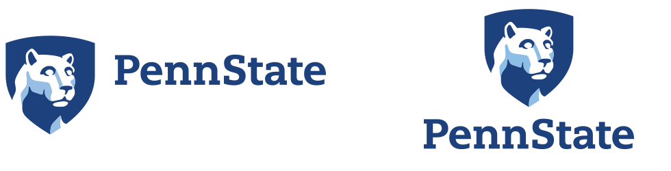 Penn State’s new Academic logo
The mark itself? It’s… boring. Corporate. Safe. Could be a bank, could be a hospital. The rendition of the lion itself is fine. I don’t love the 2-Color approach, and that’s going to be a real pain to embroider, but it’s fine. The type itself is also fine. Very contemporary, and again, very safe.
The move to a more neutral, middle-of-the-road shade of blue is disheartening. Again, could be a hospital, could be a bank.
I get why the existing mark needed some time in the shop, but compared to this new mark, it feels even more timeless.
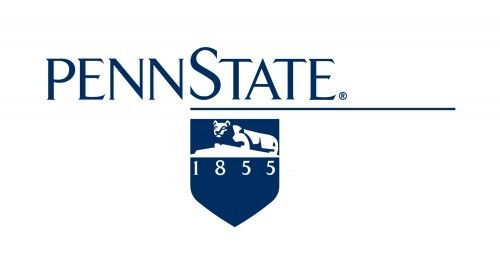 Penn State’s previous Academic logo
Maybe my comments on the new mark being corporate and safe are off the mark. Maybe that was a stated goal in the brief. I don’t know! Penn State is among the largest research institutions in the nation. Maybe a boring, corporate brand will serve them better in the long run.
But as an alumni, this new mark leaves me full of… meh. Just, meh. No visceral reaction whatsoever.
And maybe I feel so positively about the old mark because I’ve been seeing that thing since I was born. But, if you take away the Lion statue, you take away 1855, you take away that beautiful type that looks carved in stone… you better give me something really, really good in return.
To be clear, I’m laying the blame for this squarely at the University’s feet. I’m sure the firm did some great work that died in committee. For example, this is a recipe for disaster: “More than 300 members of various faculty, staff and administrative groups were engaged during the process.“ And seriously, please miss me with “they spent $128k on THIS?!??!” That’s a drop in the bucket for a rebrand effort of this scale. (If we really want to get Nit-picky (see what I did there?), I think it’s fair to ask why the University couldn’t find a PA firm qualified to do this.)
Overall, the whole thing is boring, corporate and safe. Underwhelming. I expected better from something like this, but maybe that’s my fault. Thanks for listening. We are Penn State.
(One last thing: You can change the chipmunk logo after you pry it from my cold, dead hands.)